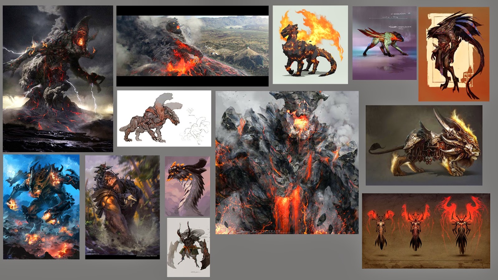
MoodBoard:

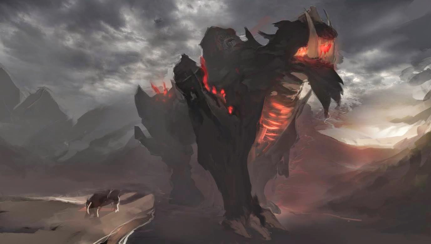
Due To my injured hand I decided to just start painting without any sketching, which isnt the best idea.
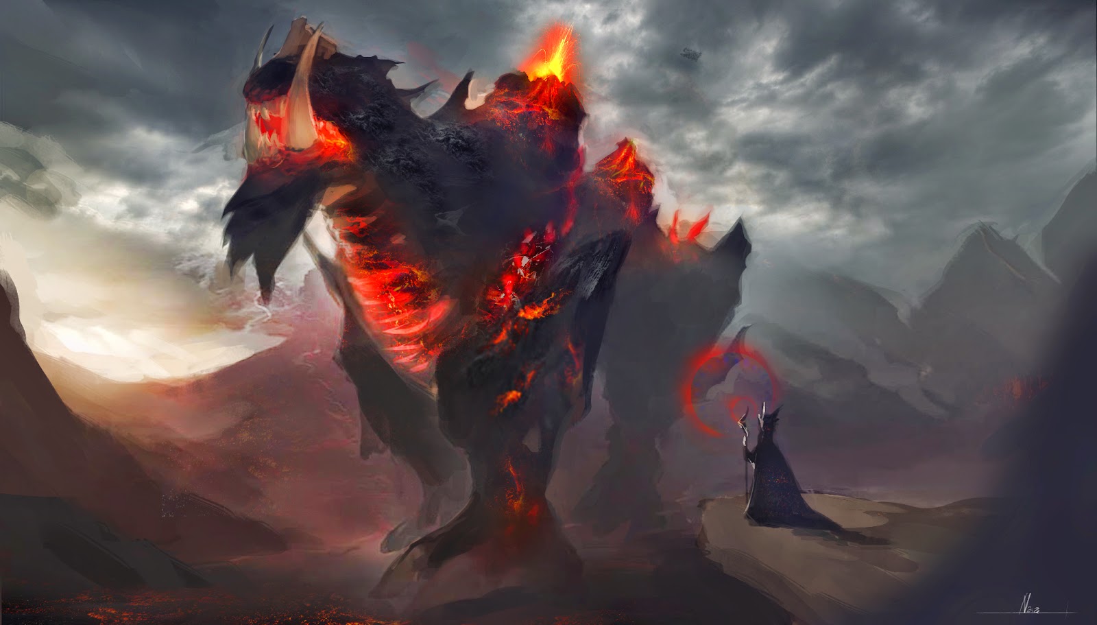
 I came up with an idea of a really huge monster with vulcanos on his back. I didnt only focus on the design but also tried creating nice environment. Since he's really big, he starts dissapearing in smoke and fog to make him look even bigger. I wanted to show his "majesticness" instead of him attacking. I tried creating this mood with softer colours and light comming from the side rather than front. After painting more, this is my final result.
 I made the colours more saturated and added texture. Im not satisfied with the way it doesnt blend in with the rest and stands out too much. I tried creating central composition but I dont think I did that well. The whole front till back plane is confusing. The distance between monsters feet and the "summoner" isnt obvious enough. I know what I need to work on nowto make my future paintings better.
No comments:
Post a Comment